Page 26 - PlanWorld_2011_en_high
P. 26
New Planmeca Compact i
instrument console design

       – art, science
         or both?

                                                  COPY LEENA AALTONEN IMAGES TIMO SILVONEN

                                                                                                      instrument is activated, it can be brought back

26 on screen with a simple swipe on the touch

                                                                                                      screen."

                                                                                                      Another important improvement is the

                                                                                                      timer that, in addition to the memory slot,

                                                                                                      shows also its preset time. The instructive

                                                                                                      help and error messages introduced in the

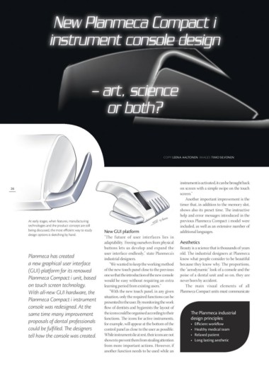
At early stages, when features, manufacturing                                                         previous Planmeca Compact i model were

technologies and the product concept are still    New GUI platform                                    included, as well as an extensive number of
being discussed, the most efficient way to study                                                      additional languages.
design options is sketching by hand.              "The future of user interfaces lies in
                                                  adaptability. Freeing ourselves from physical       Aesthetics

                                                  buttons lets us develop and expand the Beauty is a science that is thousands of years

Planmeca has created                              user interface endlessly," state Planmeca's         old. The industrial designers at Planmeca
a new graphical user interface                    industrial designers.                               know what people consider to be beautiful
                                                                                                      because they know why. The proportions,
                                                     "We wanted to keep the working method

(GUI) platform for its renowed                    of the new touch panel close to the previous the "aerodynamic" look of a console and the

Planmeca Compact i unit, based                    one so that the introduction of the new console     poise of a dental unit and so on, they are
on touch screen technology.                       would be easy without requiring an extra            never born by accident.
                                                  learning period from existing users."
                                                                                                         The main visual elements of all

With all-new GUI hardware, the                    "With the new touch panel, in any given Planmeca Compact units must communicate

Planmeca Compact i instrument                     situation, only the required functions can be       The Planmeca industrial
console was redesigned. At the                    presented to the user. By monitoring the work       design principles:
same time many improvement                        flow of dentists and hygienists the layout of
proposals of dental professionals                 the icons could be organised according to their     •	 Efficient workflow
could be fulfilled. The designers                 functions. The icons for active instruments,
                                                  for example, will appear at the bottom of the       •	 Healthy medical team
                                                  control panel as close to the user as possible.

tell how the console was created. Whileinstrumentslieatrest,theiriconsarenot                          •	 Relaxed patient
                                                                                                      •	 Long lasting aesthetic
                                                       shown to prevent them from stealing attention

                                                  from more important actions. However, if

                                                  another function needs to be used while an

