Page 21 - PlanWorld_2011_en_high
P. 21
COPY TIINA LEHTINEN AND PÄIVI HYYTIÄINEN IMAGES PLANMECA OY

Planmeca’s new,
refreshed visual identity

The new era – new face. The new, refreshed Planmeca
look greeted the IDS attendants.

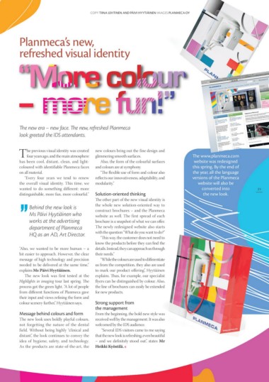
The previous visual identity was created       new colours bring out the fine design and                                    The www.planmeca.com        21
     four years ago, and the main atmosphere   glimmering smooth surfaces.                                                  website was redesigned
has been cool, distant, clean, and light-                                                                                   this spring. By the end of
coloured with identifiable Planmeca faces         Also, the form of the colourful surfaces                                  the year, all the language
on all material.                               and colours are at symphony.                                                 versions of the Planmeca

    “Every four years we tend to renew            “The flexible use of form and colour also                                    website will also be
the overall visual identity. This time, we     reflects our innovativeness, adaptability, and                                    converted into
wanted to do something different: more         modularity.”                                                                       the new look.
distinguishable, more fun, more colourful."
                                               Solution-oriented thinking
     Behind the new look is
     Ms Päivi Hyytiäinen who                   The other part of the new visual identity is
     works at the advertising                  the whole new solution-oriented way to
     department of Planmeca                    construct brochures – and the Planmeca
     HQ as an AD, Art Director.                website as well. The first spread of each
                                               brochure is a snapshot of what we can offer.
"Also, we wanted to be more human – a          The newly redesigned website also starts
bit easier to approach. However, the clear     with the question “What do you want to do?”
message of high technology and precision
needed to be delivered at the same time,”         “This way, the customer does not need to
explains Ms Päivi Hyytiäinen.                  know the products before they can find the
                                               details. Instead, they can approach us through
   The new look was first tested at the        their needs.”
Highlights in imaging tour last spring. The
process got the green light. “A lot of people     “While the colours are used to differentiate
from different functions of Planmeca gave      us from the competition, they also are used
their input and views refining the form and    to mark our product offering”, Hyytiäinen
colour scenery further,” Hyytiäinen says.      explains. Thus, for example, our specialist
                                               flyers can be distinguished by colour. Also,
Message behind colours and form                the line of brochures can easily be extended
                                               for new products.
The new look uses boldly playful colours,
not forgetting the nature of the dental        Strong support from
field. Without being highly “clinical and      the management
distant”, the look continues to convey the
idea of hygiene, safety, and technology.       From the beginning, the bold new style was
As the products are state-of-the-art, the      received well by the management. It was also
                                               welcomed by the IDS audience.

                                                   “Several IDS visitors came to me saying
                                               that the new look is refreshing, even beautiful
                                               – and we definitely stood out”, states Mr

                                               Heikki Kyöstilä.

